others-how to create a message component with vue.js 3 and bootstrap 5 ?
1. Purpose
In this post , I will demonstrate how to create a message component that can display success/warning/failure messages on demand with vue.js 3 and bootstrap 5.
Here is the final result:
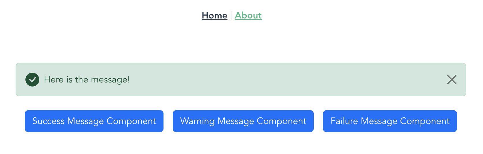
Success message:
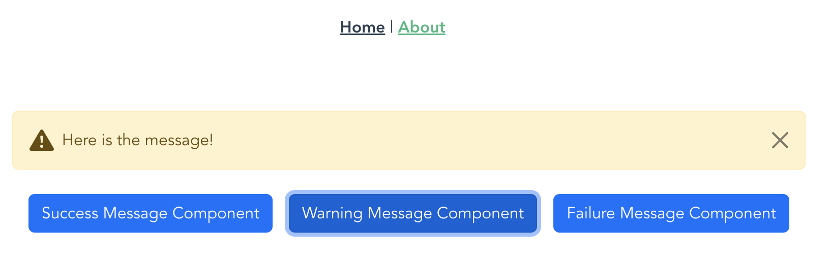
Warning message:
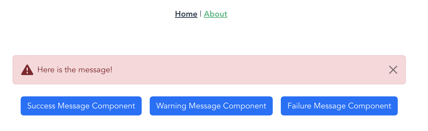
Error message:
2. Solution
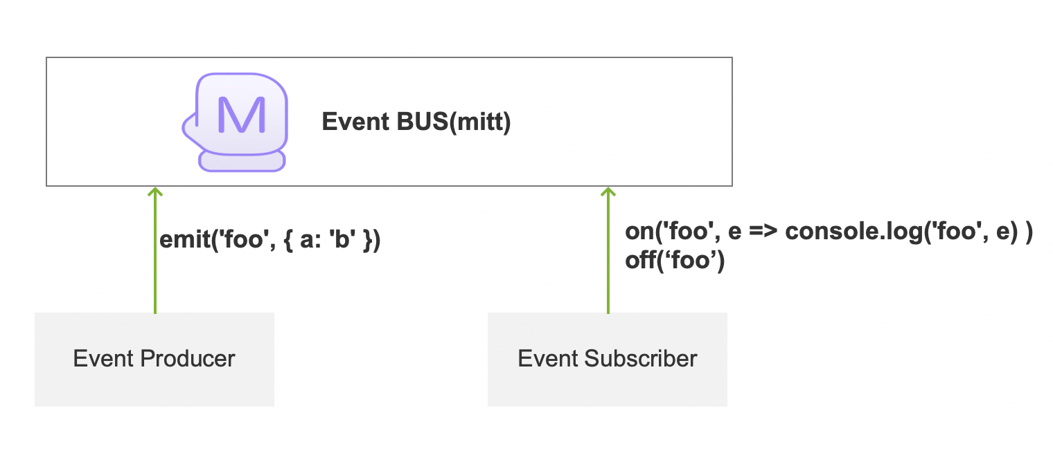
I will use mitt to create the component, which is a very small event bus library that support vue/react/agular and even jquery.
2.1 What is mitt?
Mitt is a miniature EventEmitter library that implements the basic on, off, and emit APIs. For those who use EventEmitter with few other functions, the volume of 200 bytes can be said to be very cost-effective.
Of course, smallness also has its price, e.g. it only supports these three functions. As for how to choose, different people have different opinions. I suggest to use mitt first, even if you need to replace other libraries later, because the Api is unified, it is basically easy to replace.
Basic usage of mitt:
import mitt from 'mitt'

const emitter = mitt()

// listen to an event
emitter.on('foo', e => console.log('foo', e) )

// listen to all events
emitter.on('*', (type, e) => console.log(type, e) )

// fire an event
emitter.emit('foo', { a: 'b' })

// clearing all events
emitter.all.clear()

// working with handler references:
function onFoo() {}
emitter.on('foo', onFoo)   // listen
emitter.off('foo', onFoo)  // unlisten
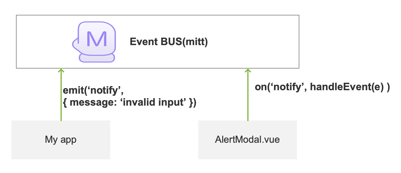
2.2 What will mitt do in our component?
In our example, we will emit a warning event when user input is invalid, and consume the event in the message component to display proper content.
2.3 How to install and enble mitt?
Install mitt:
npm install --save mitt
Enable mitt: In your src/main.js
import { createApp } from "vue";
import App from "./App.vue";
import router from "./router";
import store from "./store";
import mitt from "mitt";

import "bootstrap/dist/css/bootstrap.min.css";
import "bootstrap";
import i18n from "./i18n";


const app = createApp(App).use(i18n).use(store).use(router);
app.config.globalProperties.emitter = mitt();
app.mount("#app");
The most important line is:
app.config.globalProperties.emitter = mitt();
app.config.globalProperties is An object that can be used to register global properties that can be accessed on any component instance inside the application. It is a replacement of Vue 2’s Vue.prototype which is no longer present in Vue 3. As with anything global, this should be used sparingly. If a global property conflicts with a component’s own property, the component’s own property will have higher priority.
Properties of app.config.globalProperties can be used globally in every vue components ,for example:
this.emitter.emit("notify",{})
2.4 Create the Message component
Then we can create a vue component in src/components/Message.vue by using bootstrap v5 alert component:
<template>
  <div v-show="show">
    <svg xmlns="http://www.w3.org/2000/svg" style="display: none">
      <symbol id="check-circle-fill" fill="currentColor" viewBox="0 0 16 16">
        <path
          d="M16 8A8 8 0 1 1 0 8a8 8 0 0 1 16 0zm-3.97-3.03a.75.75 0 0 0-1.08.022L7.477 9.417 5.384 7.323a.75.75 0 0 0-1.06 1.06L6.97 11.03a.75.75 0 0 0 1.079-.02l3.992-4.99a.75.75 0 0 0-.01-1.05z"
        />
      </symbol>
      <symbol id="info-fill" fill="currentColor" viewBox="0 0 16 16">
        <path
          d="M8 16A8 8 0 1 0 8 0a8 8 0 0 0 0 16zm.93-9.412-1 4.705c-.07.34.029.533.304.533.194 0 .487-.07.686-.246l-.088.416c-.287.346-.92.598-1.465.598-.703 0-1.002-.422-.808-1.319l.738-3.468c.064-.293.006-.399-.287-.47l-.451-.081.082-.381 2.29-.287zM8 5.5a1 1 0 1 1 0-2 1 1 0 0 1 0 2z"
        />
      </symbol>
      <symbol
        id="exclamation-triangle-fill"
        fill="currentColor"
        viewBox="0 0 16 16"
      >
        <path
          d="M8.982 1.566a1.13 1.13 0 0 0-1.96 0L.165 13.233c-.457.778.091 1.767.98 1.767h13.713c.889 0 1.438-.99.98-1.767L8.982 1.566zM8 5c.535 0 .954.462.9.995l-.35 3.507a.552.552 0 0 1-1.1 0L7.1 5.995A.905.905 0 0 1 8 5zm.002 6a1 1 0 1 1 0 2 1 1 0 0 1 0-2z"
        />
      </symbol>
    </svg>
    <div v-if="type == 'success'">
      <div
        class="alert alert-success d-flex align-items-center alert-dismissible"
        role="alert"
      >
        <svg
          class="bi flex-shrink-0 me-2"
          width="24"
          height="24"
          role="img"
          aria-label="Success:"
        >
          <use xlink:href="#check-circle-fill" />
        </svg>
        <div></div>
        <button
          type="button"
          class="btn-close"
          data-bs-dismiss="alert"
          aria-label="Close"
          @click="runAction('close')"
        ></button>
      </div>
    </div>

    <div v-if="type == 'warning'">
      <div
        class="alert alert-warning d-flex align-items-center alert-dismissible"
        role="alert"
      >
        <svg
          class="bi flex-shrink-0 me-2"
          width="24"
          height="24"
          role="img"
          aria-label="Warning:"
        >
          <use xlink:href="#exclamation-triangle-fill" />
        </svg>
        <div></div>
        <button
          type="button"
          class="btn-close"
          data-bs-dismiss="alert"
          aria-label="Close"
          @click="runAction('close')"
        ></button>
      </div>
    </div>

    <div v-if="type == 'failure'">
      <div
        class="alert alert-danger d-flex align-items-center alert-dismissible"
        role="alert"
      >
        <svg
          class="bi flex-shrink-0 me-2"
          width="24"
          height="24"
          role="img"
          aria-label="Danger:"
        >
          <use xlink:href="#exclamation-triangle-fill" />
        </svg>
        <div></div>
        <button
          type="button"
          class="btn-close"
          data-bs-dismiss="alert"
          aria-label="Close"
          @click="runAction('close')"
        ></button>
      </div>
    </div>

    <!-- <span v-text="title"></span> -->

    <!-- <button @click="performAction()" /> -->
  </div>
</template>

<script>
export default {
  data() {
    return {
      show: false,
      type: "",
      message: "",
    };
  },

  methods: {
    bindEvents() {
      this.emitter.on(
        "notify",
        function (data) {
          this.handleNotif(data);
        }.bind(this)
      );
    },
    handleNotif(data) {
      this.type = data.type;
      this.message = data.message;
      this.show = true;
    },

    runAction(action) {
      this.action = action;
      switch (this.action) {
        case "close":
          this.clearNotification();
          break;
      }
    },

    clearNotification() {
      this.show = false;
      this.type = "";
      this.message = "";
    },
  },
  mounted() {
    this.bindEvents();
  },
};
</script>
For above code, you should notice the following lines:
First, we need to hide the alert message component:
<div v-show="show">
It will hide the <div> if the vue variable show is not true.
And to display different types of messages, we need to hide and show them using vue variables. For example:
<div v-if="type == 'success'">
I use v-if to hide the <div> by the vue variable type, which is exposed by the data() function in vue script.
So if type is success, it will show success style message, if type is failure, it will show failure style message.
And when user click the button:
@click="runAction('close')"
It will call method runAction('xxx') in methods() of vue.
When this component is mounted, it will bindEvents to listen to event notify, and use handleNotif method to handle it.
2.5 Now use the Message component
Now the Message component is ready, we can use it in our pages.
In the following example, I declare one Message Component and add three buttons to demonstrate all types of the Message component.
<template>
  <div class="row">
    <div class="m-3">
      <Message class="m-2" />
      <button
        type="button"
        class="btn btn-primary m-2"
        @click="showMessage('success')"
      >
        Success Message Component
      </button>
      <button
        type="button"
        class="btn btn-primary m-2"
        @click="showMessage('warning')"
      >
        Warning Message Component
      </button>
      <button
        type="button"
        class="btn btn-primary m-2"
        @click="showMessage('failure')"
      >
        Failure Message Component
      </button>
    </div>
  </div>
</template>
<script>
import Message from "@/components/Message.vue";

export default {
  name: "Card",
  data() {
    return {
      showImage: false,
    };
  },
  props: {},
  methods: {
    showMessage(theType) {
      this.emitter.emit("notify", {
        type: theType,
        message: "Here is the message!",
      });
    },
  },
  components: {
    Message,
  },
};
</script>
The above line:
<Message class="m-2" />
We use class m-2 to define the margin of the Message Component, to make them seperate to each other.
When user click the button, it will call method showMessage(theType), then the method use the mitt to emit an event to update the component:
    showMessage(theType) {
      this.emitter.emit("notify", {
        type: theType,
        message: "Here is the message!",
      });
    },
Run the app,
npm run serve
We got such messages:
Success message:
Warning message:
Error message:
3. The code
The project’s source code has been uploaded to github, you can download or clone it: https://github.com/bswen/vuejs-project/tree/main/vue3-bootstrap5-example
4. Summary
In this post, I demonstrated how to create a message component with vue.js 3 ,mitt and bootstrap 5. That’s it, thanks for your reading.